MS Therapy Centre rebranded logo
Overview
Working within a team of 4, we were tasked with rebranding the MS Therapy centre Berkshire, Reading. After a series of visits to the therapy centre, we noticed a strong sense of community and tranquility, with a strong smell of lavender throughout the centre. We translated the essence of the MS Therapy centre into the logo, creating the lavender logo and adopting a calming purple colour palette.
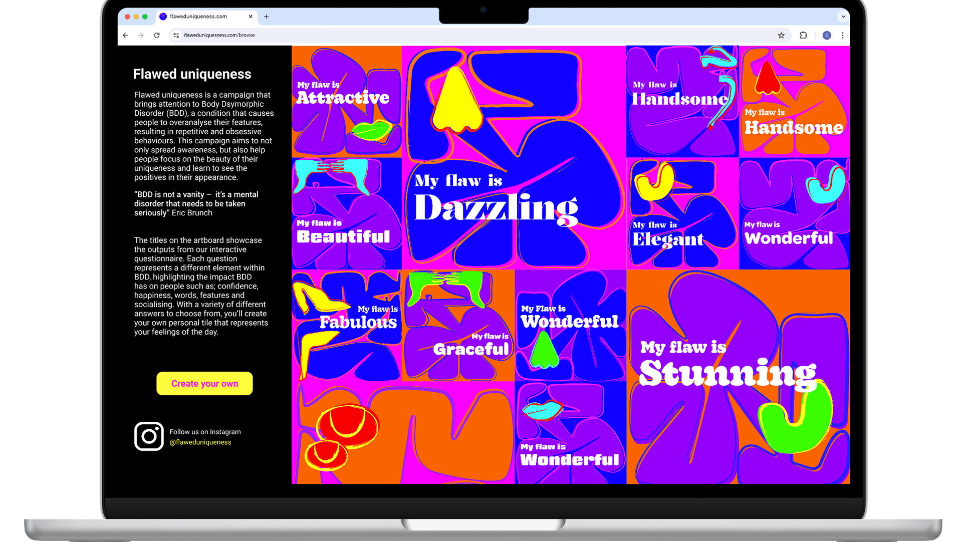
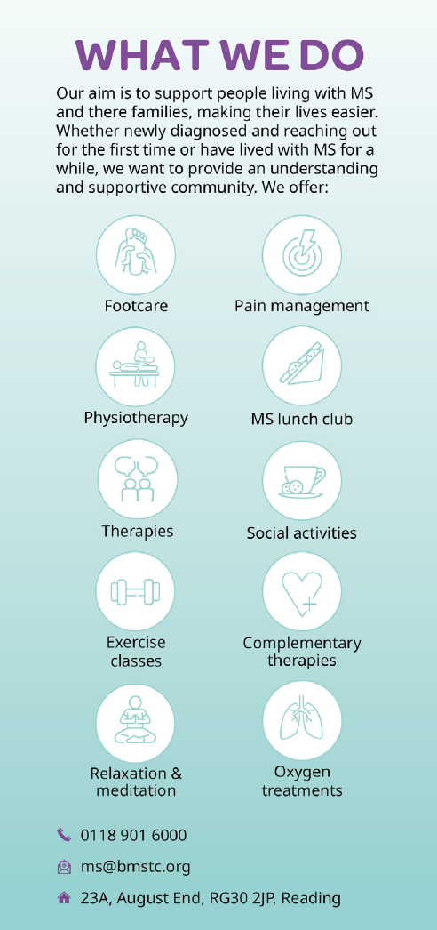
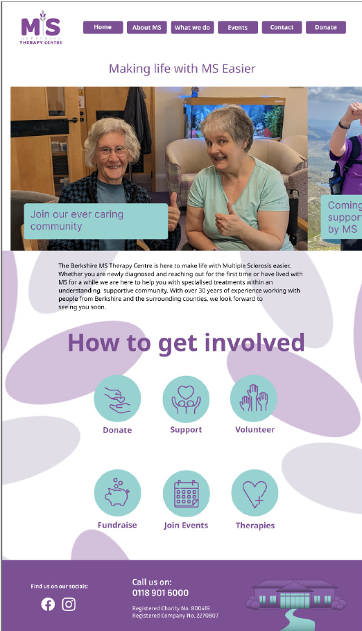
Along with the overall rebrand, the team and I applied the brand to a series of outputs for the therapy centre to use. These outputs ranged from updated social media platforms, re-formatted website, events and a series of leaflets. These items were chosen as we felt they needed an upgraded, as well as ensuring the therapy centre gets the most from the rebrand we created.
Applying the brand:
Once the logo was created, the branding was applied across the different outputs. The colour palette was made up of purples, turquoise and a contrasting orange. Along with a new colour palette, a series of icons, imagery and tone of voice were introduced. After introducing these brand components we were able to ensure consistency across all the different outputs.
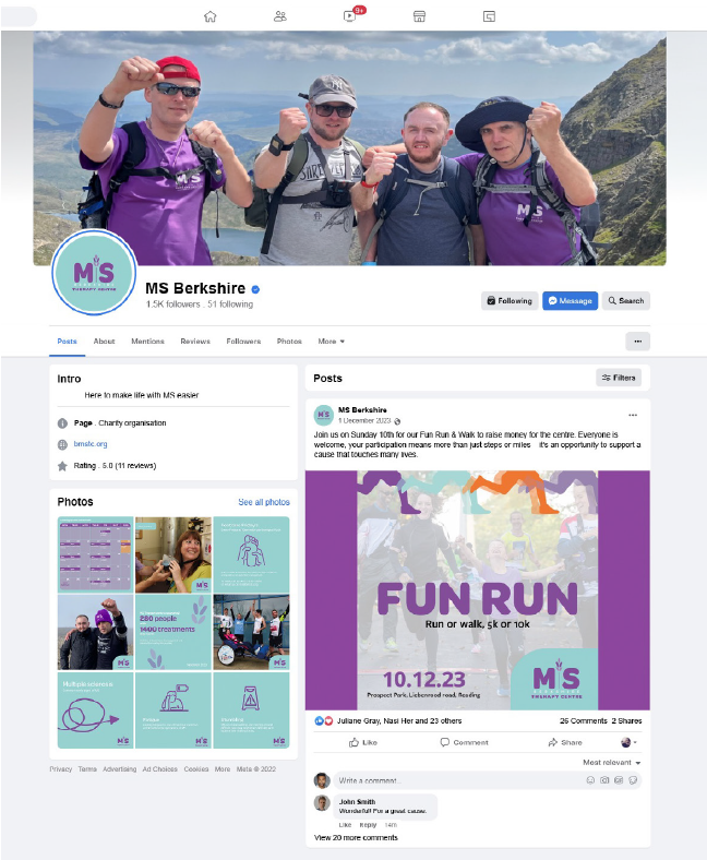
Rebranded MS Facebook page

Proposed MS Instagram page
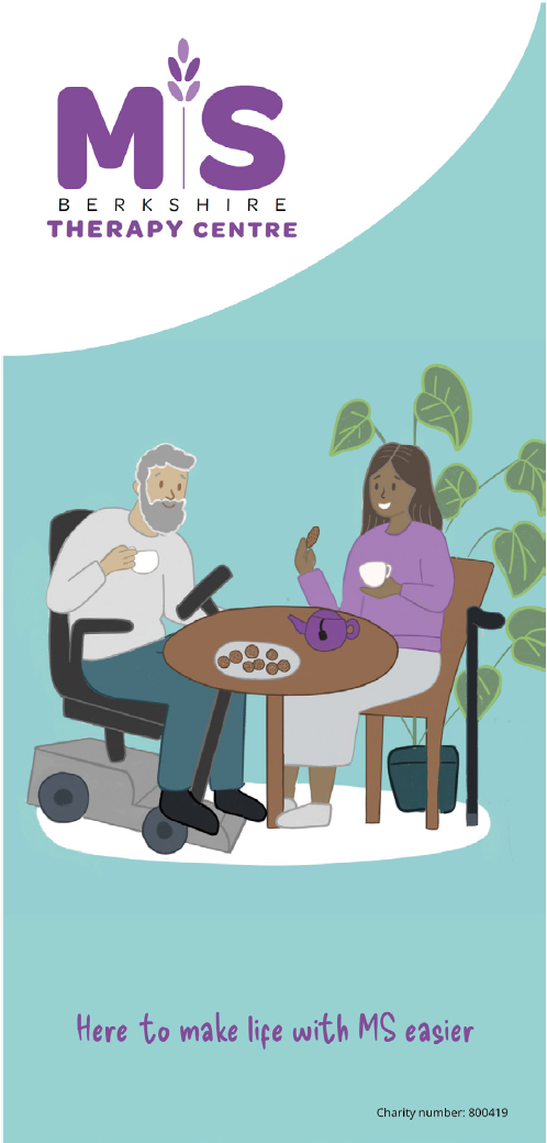
Rebranded MS leaflet

What I learnt
Not only did this project provide new insight into branding, but also insight into communication and strategy. Understanding the audience was an essential part of this project, and with the help of a workshop, myself and my team completed, we were able to learn about what makes up a brand. By recognising the brands audience, it enabled us to effectively communicate the brand through our tone of voice. By focusing on the needs and characteristics of the therapy centre, I was able to learn about the importance of an impactful brand that is effectively resonate with its audience.